This website uses cookies so that we can provide you with the best user experience possible. Cookie information is stored in your browser and performs functions such as recognising you when you return to our website and helping our team to understand which sections of the website you find most interesting and useful.
Artist News Business News Legal
Cher’s lawyers tell graphic designer to font off
By Chris Cooke | Published on Wednesday 8 March 2017

Lawyers for Cher and her label Warner Bros are attempting to have a font infringement case that has been launched against the singer dismissed on the basis that the plaintiff’s typeface is not protected under American copyright law.
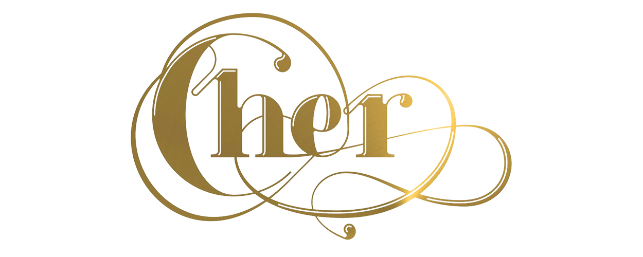
The lawsuit relates to the way Cher’s name is written on the artwork for 2013 album ‘Closer To The Truth’. Graphic designer Moshik Nadav says that the letters spelling out the singer’s name on the record copy – without permission – a typeface that he created called Paris Logo. He adds that the “artistic elements” of that typeface create an “aesthetic look and feel” that graphic designers associate with him and his company.
Whether or not copyright protects a typeface varies from country to country, and the rules can be confusing even when there is some protection (and all the more confusing given the technical different between ‘typeface’ and ‘font’ – the latter might be protected but the former not). But, generally speaking, US copyright law doesn’t protect typefaces.
That’s a point that is unsurprisingly at the heart of a legal filing made by Cher’s attorney Leonard Venger, who is attempting to have Nadav’s case dismissed.
According to The Hollywood Reporter, the lawyer notes that Nadav also suggests that the way Cher is written on the ‘Closer To The Truth’ cover copies the logo for his Paris typeface, which is protected by US copyright law. The logo for the typeface is simply its name written in the typeface itself. But Venger rejects that claim too.
He writes: “Perhaps based on the inability to rely on their typefaces as the basis for their claim, plaintiffs also allege that the Cher logos are substantially similar to the Paris Logo and the Paris Pro logos, for which plaintiffs own copyright registrations. That claim fails as a matter of law due to the profound differences between plaintiffs’ logos and allegedly infringing works”.
The legal man continues: “The Paris and Paris Pro logos share just one letter with the Cher logo – an ‘r’. In addition, plaintiffs’ attempts to rely on other letters included within the Paris typeface (but not in the Paris or Paris Pro logos) to support their infringement claim is improper and unavailing”.
So that’s fun isn’t it? In other fun font news, it turns out that the typeface we use on the CMU website doesn’t have a


